
D2 Place App
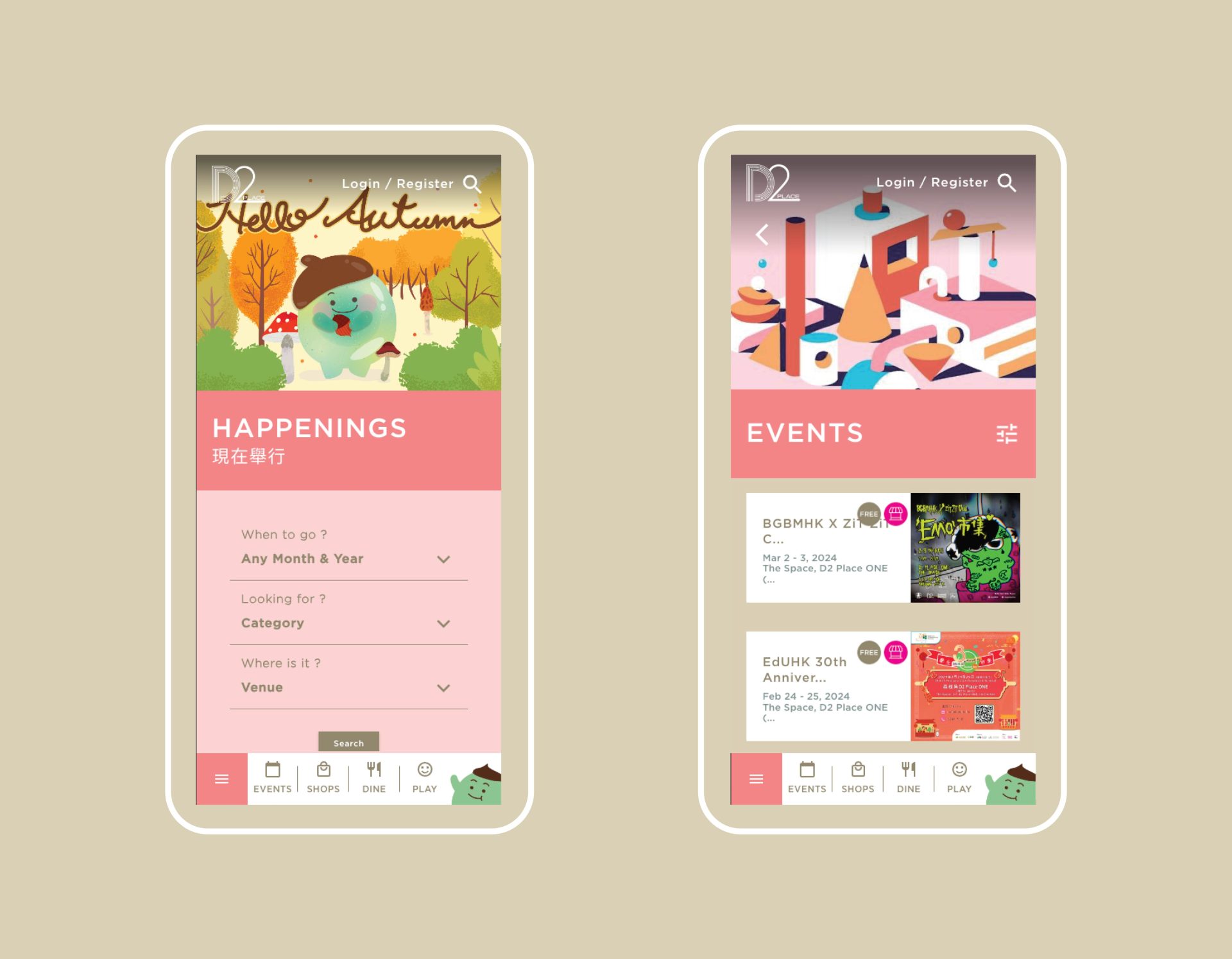
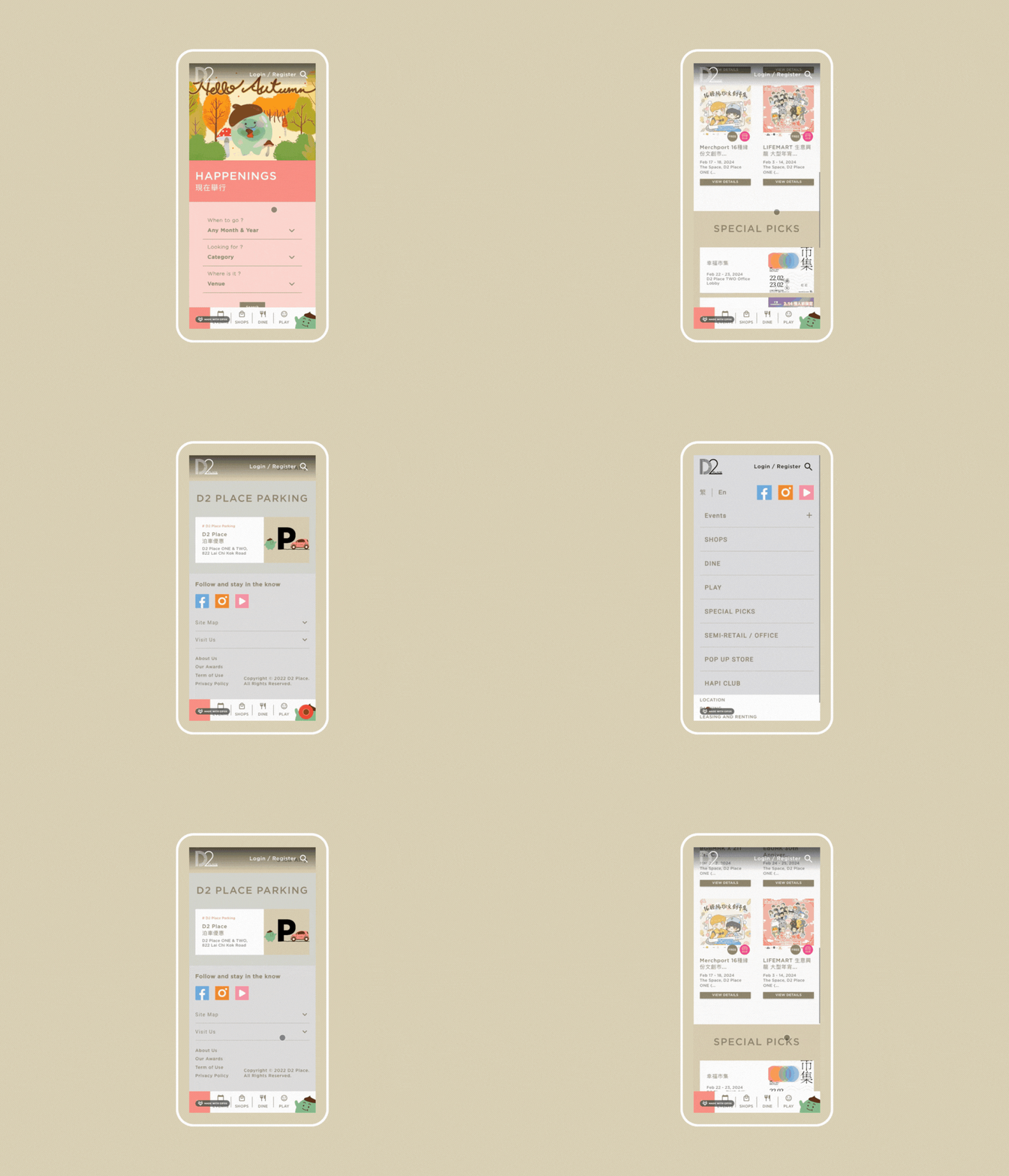
Our team strategically separated the frontend (mobile-first interface) from the backend system (API), enabling seamless integration with in-house systems and future scalability. To ensure widespread usability, we created a comprehensive clickable mock-up, guiding stakeholders through various use cases. Additionally, we developed a tailored content management system to meet the dynamic needs of the retail industry, streamlining data updates and enhancing operational efficiency.
Task
The strategic separation of the frontend (mobile-first interface) from the backend system (API) to facilitate seamless integration with in-house systems and accommodate future scalability.

